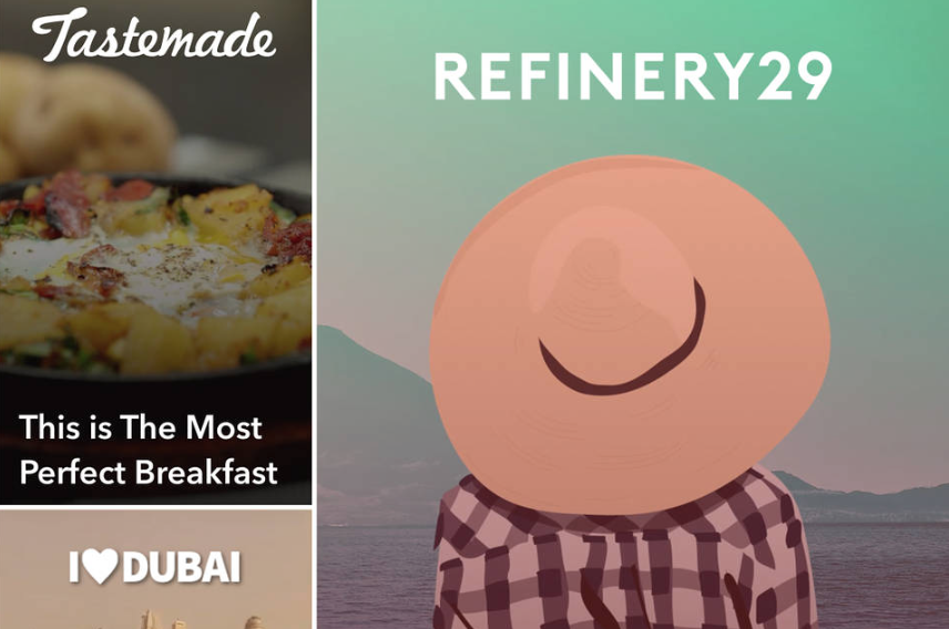
Snapchat’s popularity has grown significantly over the past few years, and it’s even getting to the point where the app sees more daily usage than Twitter. Its “Stories” section in particular has seen quite a bit of traction, and its latest redesign could help brands make the most out of attracting this large user base.
The company’s latest redesign will help companies put together content that posts directly onto the app, using a number of tools to help attract would-be subscribers, according to the Wall Street Journal, which is one of the 20 publishers ready to use the new feature.
Other publishers, including BuzzFeed, Vice and Cosmopolitan, are already taking part in the program, with images and headlines being put into play to lure in potential fans. There’s also an option to subscribe to these channels, which would put stories from companies into the same area where they get updates from friends.
This content will blend in alongside the “Live Stories” section, as well as the “Discover” section, giving them plenty of opportunity to be found by the millions of daily Snapchat users.
This appears to be part of Snapchat’s process to integrate advertising business into its app, so that users will view more content from its partners. It’s a move that’s likely to make publishers very happy, with the opportunity for better business promotion. Considering how Snapchat’s net worth right now sits at $16 billion (with $500 million raised from investors), it’s a move that will not only appeal to current partners, but also one that could bring in new ones.
With a number of devoted teams (namely at IGN and Snapchat) hard at work on Snapchat content, this could be a move for the better. “With the product change, it takes things to the next level in really allowing us to showcase a little bit of a teaser of the look and feel of what’s to come in that edition,” Oren Katzeff, head of programming at Tastemade, speaking with AdWeek.
“Everything [up until now] has been behind a wall—you have to press the logo to then get taken to the experience,” he said. “What’s exciting about the redesign is that it allows you to take some of the content that’s performed well and showcase it more.”
The redesign is live now, so users can see just how well this content blends in, and how attractive the headlines and images come across.

