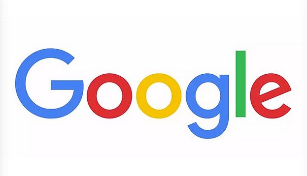
The times, they are a-changin’. After 17 years, Google has changed its routine logo into something a little more modern with the times — and that keeps its brand more consistent across the new divisions and product lines that resulted from Google’s recent reorganization.
After sticking with a logo that has kept a colorful but somewhat plain typeface for almost two decades, the company changed it this morning, going with a more contemporary appearance, but still keeping the same colorful motif, as you can see above.
VentureBeat initially reported on the logo, stating that Google changed it in an effort to revamp its “identity family,” so that people would be able to recognize it better in terms of design branding. This includes seeing it on computers, phones, televisions, watches and more. The video below highlights just how the logo has “evolved.”
As to why the change was specifically made, the company released the following statement:
“It doesn’t simply tell you that you’re using Google, but also shows you how Google is working for you. For example, new elements like a colorful Google mic help you identify and interact with Google whether you’re talking, tapping or typing. Meanwhile, we’re bidding adieu to the little blue ‘g’ icon and replacing it with a four-color ‘G’ that matches the logo.”
“This isn’t the first time we’ve changed our look and it probably won’t be the last, but we think today’s update is a great reflection of all the ways Google works for you across Search, Maps, Gmail, Chrome and many others. We think we’ve taken the best of Google (simple, uncluttered, colorful, friendly), and recast it not just for the Google of today, but for the Google of the future.”
The company also released a couple of animated GIF’s to show the subtle differences between the old and new logos, which can be found below.


“Everyone who’s going anywhere is going mobile, and that means making things more streamlined, easier to read and more intuitive to interact with. Google’s new makeover makes the most of this, with simplified letterforms, iconic imagery and colorful, eye-catching animations. Bravo, Google,” said Ayzenberg’s Stu Pope, regarding the rebranding.
The news comes on the heels of the company’s recent Alphabet announcement, which will bring another parent company into the fold sometime over the next few months. How that will be effective has yet to be seen, but we’re likely to see more details — and not just the cryptic “G is for Google” — very soon.

